E-COMMERCE WEBSITE REDESIGN
BOLD BEAN COFFEE ROASTERS
-
Bold Bean Coffee Roasters, a Jacksonville, Forida-based coffee company. They have :
Three local cafes
50+ wholesale accounts
Roasting warehouse
Wholesale bakery brand, Knead
-
In winter of 2019, Owner Zack Burnett was looking to move their existing site from its current platform to Squarespace to have greater control of the editing and art direction. Bold Bean was also looking to simplify the visual brand, and to create a cohesive look between the site and the physical branding.
This project (from research to launch) took about 2 months.
-
I led this project as a UX Researcher, UX/UI Designer, and Visual Designer.
Grant Sanders worked on fine tuning/development, and Austin Ellis provided Product Photography.
Research —
Competitive Analysis
This analysis was the main form of research before beginning the design process of the site. I looked at a handful of sites by successful e-commerce coffee brands - especially others who were emphasizing their third wave coffee culture + education. I noticed these site features:
Large “clean” looking hero photo, “SHOP” or “BUY” button on home page, above the fold
Minimal nav bar, but includes “account” functionality for customers/wholesale accounts
Vibe is professional but handcrafted, art adjacent
Site Mapping - Competitors
I mapped out the other brands’ site organization, grouping them by their location on the site. When reflecting, I tried to gauge similarities between the sites’ pages and if those menu items would fit the needs of our users. I took that information and compared our old information architecture to those findings, carrying over what was most important.
Onyx Site Pages (left column), nested features & pages beside them
Stumptown Site Pages (left column), nested features & pages beside them
Insights: Competitive Analysis Site Map
These competitors were 1. Large e-commerce coffee brands and 2. BIG on education on coffee and where it comes from. I noticed:
Product pages had a LOT of information about the origin of the coffees/products
Lots of personality and backstory, and pages/sections devoted to learning about coffee and brewing methods
The shop & learning sections flow throughout each other
Planning —
Site Mapping - Bold Bean
Before creating our new info architecture map, I wrote sticky notes of ALL parts and features needed on the site.
I rearranged them, grouping them under the most important tasks: to shop, to learn how to become a partner, to learn about our coffee/methods, to visit IRL. Simpler tasks could be grouped, like contact or login.
I kept the main emphasis on BUYING COFFEE, but then was able to arrange our map to then focus on education. There was a lot of information that needed to be shared, so I decided on a long-scroll format for those pages, verses creating more clicks for the user.
Designing —
Wireframes


UI and Branding
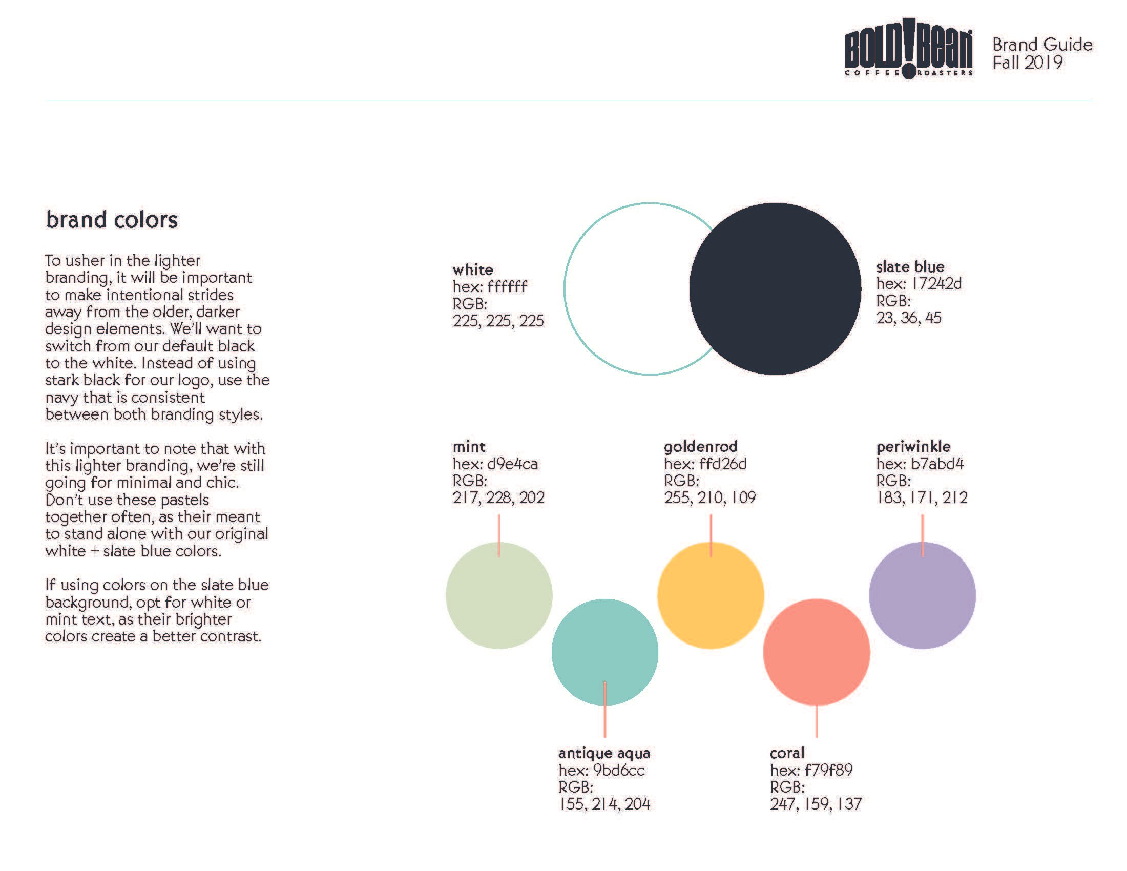
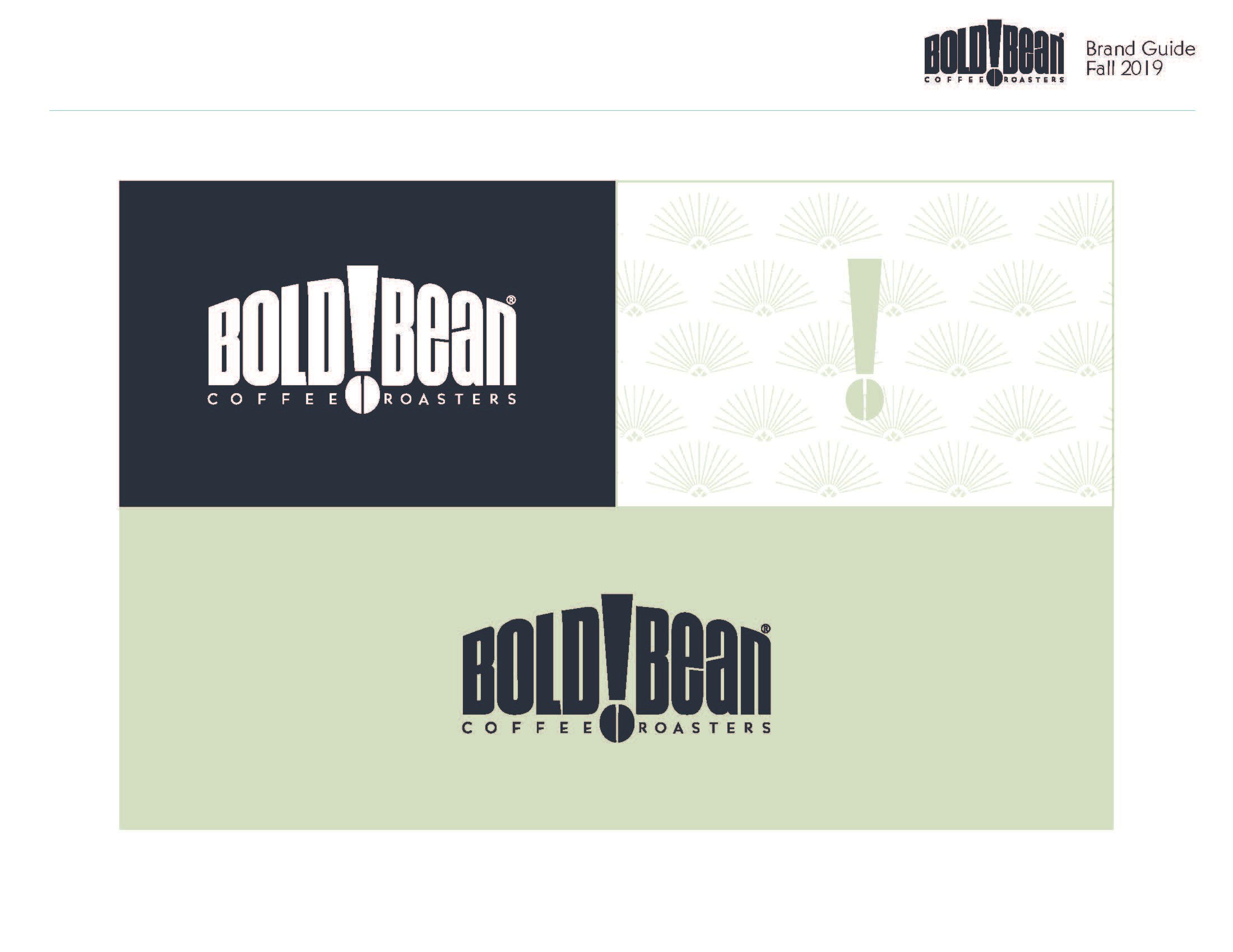
Revising the site to better represent the new, brighter branding was one of the main motivations of the project. I created a persona of our brand - creating a character of sorts with motivations, hobbies, and characteristics to inform the design decisions. SEE THE BRAND BOOK HERE.
Old Bold Bean Branding


New Branding


Final Site —
We launched our site within the first week of the pandemic - working hard to help our *very offline* audience follow. The site was to be minimal with a modern look and feel. I wanted to keep an air of humanness, as our main touchpoint with our users is typically in the coffee shop and I wanted the digital to reflect that. Education and details on sourcing were highlighted on our product pages using illustrations, charts and photos to further show what the brand is all about - serving great coffee from real people.
Critical Analysis
You may be asking: where’s the user? And - trust me - I would agree! This project was started in early 2020, to initially be worked on steadily through the spring. As the pandemic hit in March, I was rushed to finish, working overtime to make sure our e-commerce pages were set up and ready to conduct legal trade. We worked among our team to iron out any of the usability kinks, and I put final touches on the site as our first users started to order coffee bags.
If I were to do it differently, I would do interviews and surveys in the beginning research period. With this, I could break down our users motivations and journeys. I had to assume a LOT about our users in order to flip the site around in time, hoping that with our thoughts mixed with the information from the competitive analysis’ were enough to get our users what they wanted/needed. The business motivations became the main driver of the site halfway through, and while that’s the reality sometimes, it doesn’t feel great as a UX Designer. I would have loved to speak to the users more - before and after designing!


