MUSIC CONCIERGE SERVICE WEBSITE REDESIGN
DEBOP BY DEB OH
-
Debop is a music curation service by Deb Oh, a well respected music supervisor, musician, and songwriter.
Debop provides a mixtape gifting service for their music lovers and their loved ones.
-
In 2021, Deb Oh wanted to update Debop, matching its futuristic (yet human!) product to a site that’s equally as chic. The site needed:
Updated and beautiful design based on new branding
Functionality to host the mixtape-making itself, complete with survey giving and account making
Accessible and clear information about Debop’s product
-
I led this project as a UX Researcher, UX/UI Designer, and Visual Designer.
Charlene Kay + JG Debray worked on the branding.
Updated landing page
Final Site
PROCESS:
RESEARCHING - SITE ANALYSIS, COMPETITIVE ANALYSIS, USABILITY TESTING
PLANNING - SITE MAPPING
DESIGNING - WIREFRAMES, DESIGNING, UI + BRANDING
Researching —


Original Site Analysis Summary
The Debop site was overall professional, but basic and a bit outdated. Thoughts included:
Dark and mysterious, not up to date with new branding
Hard to tell one page from another
Product process could be visually clearer
Site pages could be condensed
Actual finished product page doesn’t look unique enough compared to the other pages


Competitive Analysis
Understanding what’s already been done in the selected space - especially if I’m working on a particularly unique product - is my next step. Songfinch and Kollect.fm have different products altogether, but since the process looks similar to Debop, I decided to analyze their design approaches. I noticed these site features:
Both were able to make their processes clear, though not always concisely
Kollect.fm had very minimal UI, while songfinch had rather clunky UI, making for completely different browsing experiences
Both needed to push users to checkout


Usability Testing
SInce we had an initial product to work with, I wanted to get users in the mix right away to start seeing where the pain points were. I moderated qualitative remote testing on four individuals of three different age groups. The goal was to gather their general thoughts of this site and the product, as well as see how easy it was to complete a few simple tasks.
Tasks included:
“I want to buy myself “the Debop” - Could you walk me through purchasing one?”
“I don’t understand what a debop is - could you find me an
example of one?”
“I have some remaining questions for the owner before I get my debop - how should I go about asking them?”
I then drew insights from there (seen on page 2 of the gallery to the right) and created a “must have” feature list to reflect those changes.
Planning —
Site Mapping - Debop
After drawing my conclusions from the usability testing, I arranged my information in order of importance. “What is it” and “how does it work” were imperative to answer as soon as the user got to the site.
I decided on a long scroll home page, giving users all of the necessary information there, along with links to move them to the shopping process.
Designing —
Wireframes
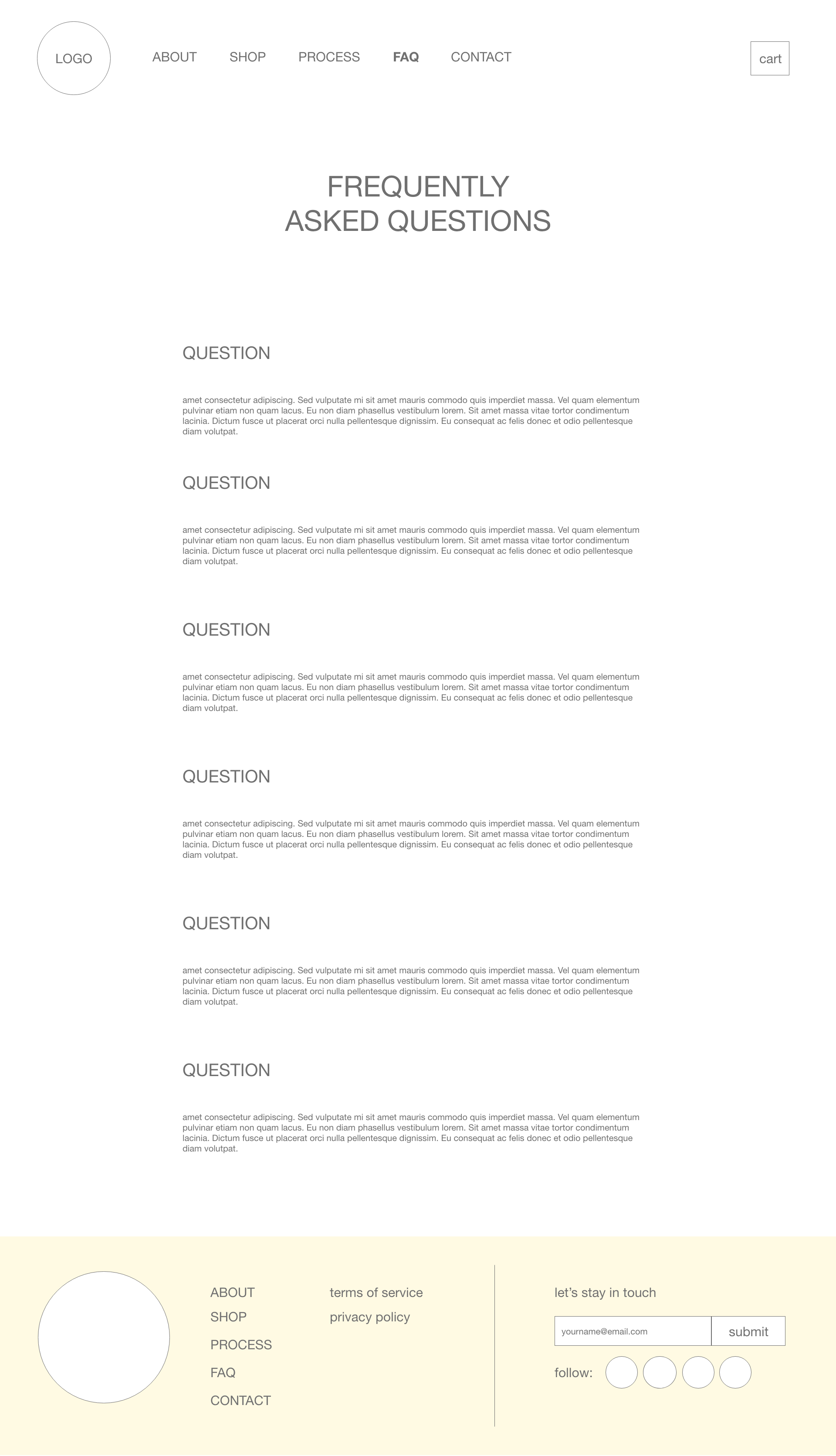
When I started to design, it was imperative I didn’t reinvent the wheel. Below is a gallery of the wireframes I made, labeled below with their purpose. The goal with this site was to keep it well organized, beautiful, and concise.


UI and Branding
Equipped with this Kaye/Debray Debop Brand Book in hand, I was able to translate the colorful and engaging art direction to the site. A far cry from the once all-black site, it creates a movement and excitement for this unique product. I was able to pull everything - from gradient, to fonts, to illustrations - from this brand book book and onto the site.
New Branding


Final Site (seen above)
This new version of Debop launched in late 2021. With help of the brand book and lots of custom CSS, we were able to watch the site visually transform. For the user experience, having users a part of the process from the beginning informed a lot of the site’s mapping. We were now able to answer user questions before they even had them.
Reflecting -
Critical Analysis
One area I wish I had a bit more time to noodle in would be the functionality of the Debop product itself. We needed the site to be able to host custom Debops (password protected) for the customers. There was a bit of difficulty with these pages, and the storage of their survey information. While it got fixed eventually - knowing that ahead of time could have given us a chance to create a better system.
Overall, my main concern was: how will we share all this information without leaving users with huge overwhelming text blocks? By creating more concise information blocks, we were able to use different layouts, hierarchies and graphics to break up the content and make it digestible. It’s still a “shop,” of sorts, but it’s more about the experience than the actual “add to cart.”


